Colour works in mysterious ways. Ask anyone who paints or draws, sews or knits. Crafty types know you put a one colour next to another and it'll sing out, looking bright and lively. Put the same colour next to another shade and it'll be dull as ditchwater, assuming an air of drabness.
Sometimes choosing and placing colours is instinctive. Others times, it's more trial and error.
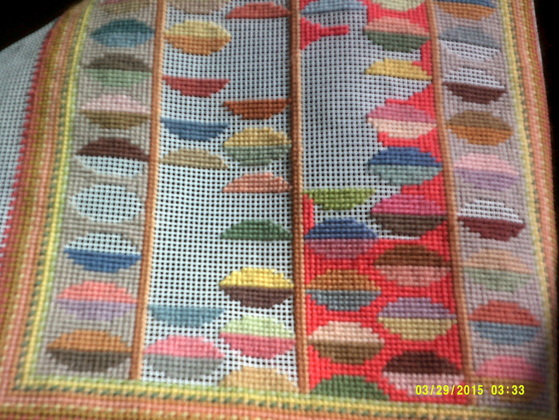
With this needlepoint, destined to end up as a cushion cover, I had the idea of placing the stylized leaves on stems against a neutral background of cream wool. I thought the colour of the leaves would pop out against that plain ground.
But I ran out of cream wool, and couldn't afford to buy new.
So I made do with what I'd got and used a greyish-brownish shade. Neutral? Yup. But a good choice. I'm now thinking 'nope'. The leaves merge into the neutral background. It makes them seem muddy. Since I began filling the central section with a strong coral colour I've realised the neutral choice doesn't do what I intended.
Contrary to what you might imagine, the vivid colour allows the leaves to be vivid too. The coral doesn't detract from the yellows and pinks and blues etc, but makes you see them more clearly.
So now I know what I need to do .... I should unpick that greyish-brownish wool. A cheerless task, but otherwise I'll always look at that cushion and think it's not right. Of course it's always better to realise you've made a poor colour choice before you've spent ages stitching, but better late than never, eh?
Sometimes choosing and placing colours is instinctive. Others times, it's more trial and error.
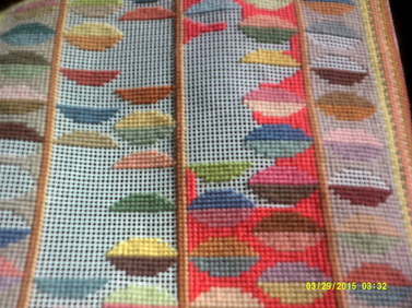
With this needlepoint, destined to end up as a cushion cover, I had the idea of placing the stylized leaves on stems against a neutral background of cream wool. I thought the colour of the leaves would pop out against that plain ground.
But I ran out of cream wool, and couldn't afford to buy new.
So I made do with what I'd got and used a greyish-brownish shade. Neutral? Yup. But a good choice. I'm now thinking 'nope'. The leaves merge into the neutral background. It makes them seem muddy. Since I began filling the central section with a strong coral colour I've realised the neutral choice doesn't do what I intended.
Contrary to what you might imagine, the vivid colour allows the leaves to be vivid too. The coral doesn't detract from the yellows and pinks and blues etc, but makes you see them more clearly.
So now I know what I need to do .... I should unpick that greyish-brownish wool. A cheerless task, but otherwise I'll always look at that cushion and think it's not right. Of course it's always better to realise you've made a poor colour choice before you've spent ages stitching, but better late than never, eh?